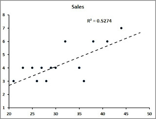
One of my favorite charts and accompanying functions are Scatterplot (XY) Chart and the Coefficient of Determination function.
A Scatterplot Chart is commonly used to show the relationship between two variables or sets of data. For example, a sales manager could plot the number of sales calls taken with the number of sales made. Another example is comparing the average length of time a customer service representative takes per call and the overall quality score of their calls.
To determine how strong the correlation is between the sets of data, the wily Excel user can make a Scatterplot Chart and:
1. Right-click on one of the data points and
2. Choose Add Trendline
3. Right-click the Trendline and choose Format Trendline
4. Format the Trendline to your aesthetic preferences and
5. Put a Checkmark next to Display R-squared Value on Chart
The R-squared value is your Coefficient of Determination (COD) that will tell you how strong your data on your two axes. In the graph example above the COD value is .5574 (or approximately 56%) representing a strong correlation (and therefore reliable).
There you have it! Try using a Scatterplot and Coefficient of Determination sometime when seeking the correlation of data sets. It’s easy and can reveal some valuable information.
Happy Thanksgiving All!

1 comment:
Post a Comment