Wednesday, June 25, 2014

Text to Columns

Today’s topic concerns a tool that is very basic to use, but one which a great many of Excel users never use.  From several conversations I have had with other Excel people over the years, it appears that few are aware of the Text to Columns feature in our favorite program.

As we well know, data isn’t always presented in the most ideal formats.  There are frequently times when it comes from a variety of sources outside of Excel; Sometimes even from Word documents, Gasp!  So how does the Text to Columns tool work?  Here is what you do:

For sake of illustration, let’s use the following string of numbers (remember, this is intentionally rudimentary…) that you may find in a Word document or any other numerous sources:

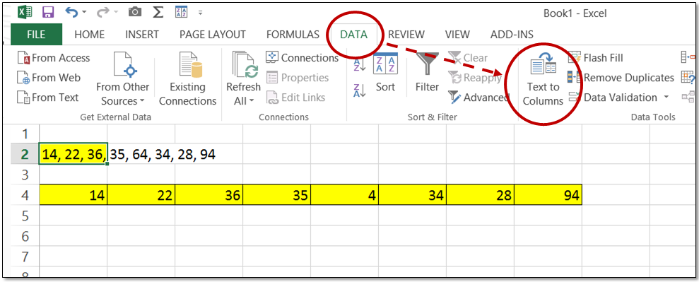
14, 22, 36, 35, 64, 34, 28, 94
 
1.     Simply select the string, copy it, and paste it into a cell in Excel (in this example, A2 was used)
2.     Select the cell and click on the Text to Columns icon on the DATA ribbon
3.     The Convert Text to Columns Wizard will appear giving you the following two major options:
a.     Delimited – Characters such as commas separate each field
b.     Fixed width – Fields are aligned in columns with spaces between each field
4.     In our example, we choose Delimited since our numbers are separated by commas
5.     Following the next steps in the Wizard gives you the choice to pick your desired format:
a.     General
b.     Text
c.      Date

Badda-bing!  It really is that simple to get your data into Excel in proper alignment and format.  The Text to Columns tool may be just the ticket for that task just around the corner!

Thursday, June 19, 2014

Gantt Charts in Excel

When used correctly and consistently, Gantt Charts can be invaluable tools to managers, analysts, and employees in the front lines.  So what, exactly, are Gantt Charts?

Well, first of all, they are a comparatively simple bar charts that illustrate and track the evolution of a project.  Developed by a management consultant by the name of Henry Gantt back in the early 20th century.  These respected charts clarify the start and finish dates of a project’s elements, and can be easily grasped a quick glance.  Groundbreaking at the time they were developed, Gantt charts are considered mainstream today.

Along with Microsoft Project, there are several specialty software solutions for producing these charts.  For many, however, good old Excel handles this quite satisfactorily, thank you.  Here is what you should do:

1.     Open a New workbook in Excel (version 2013 is recommended)
2.     Type in “Gantt” in the Search for online templates box
3.     Choose the Project Planner template and click Create


The Project Planner Gantt chart template will then open, and you can customize it to suit your business and aesthetic needs.  Please Note: You can access Manage Rules under Conditional Formatting on the Home ribbon and revise the formatting and range of the chart.  I recommend that you modify the formatting, as the default, IMHO, is rather ugly.

With these easily created and used Excel Gantt Charts, you can quickly see where each activity is according to plan.  Give it a try the next time a Big Project comes by!

Thursday, June 12, 2014

Text + Formula


Better and more powerful communication is always a worthy goal.  This is, of course, just as true in Excel as in other business venues.  One way to do this is to Mix Text with Formulas

By using the Concatenation (simply done with Ampersands) feature along with Formulas, you can build interactive messages within your reports, making them easier to understand and less likely to incur human error.

Using the example illustrated below (click on it to enlarge it), let’s say that you have a table of data and a formula that returns the sales for the 4th quarter in cell G6.  The formula in G6 interacts with the dropdown box in cell C4, (dropdowns are a snap to create using a Validation list…), to display the 4th Quarter Sales by Rep.

You could stop there and hope that the users of the report understand what is being shown, or you could create a piece of Excel Magic in cell F6

As you can see in the formula bar, a Text string is used in conjunction with the name being shown in the dropdown box in C4=“4th Quarter Sales for ”&C4&“:”

The outcome is an Interactive Message that works with the dropdown box and the results of the formula used in cell G4Note:  Leave a space after the end of the text string so as to mimic a proper sentence.


As illustrated, try using ampersands with text strings combined with formulas in your next report.  Your users will thank you!

Thursday, June 5, 2014

Self-Expanding Charts Revisited

Sometimes you find a technique that is So Useful and So Easy that it may make you laugh.  I wrote about this topic a couple of years ago and since it is such a vital, albeit modest trick, it is worth revisiting and illustrating.

As is often the case, many Excel users of all levels spend a great deal of valuable time doing things that can be automated.  It may keep the unenlightened ones busy, but there are better ways to find self-worth.

Take Updating Charts for instance.  If you have worked in a responsible position as an Excel professional for an appreciable length of time, you undoubtedly have found yourself spending time doing the repetitious and tedious task of keeping the charts in your reports in sync with your revised data.

One painless way to avoid having to do this is to create a Self-Expanding Chart that requires no effort to maintain its currency.  If you using Excel 2007 or later, it couldn’t be easier.  Here is what you do:

1.  Create your Chart as you normally do
2.  Select any cell that contains the data that is used by the chart
3.  Choose Insert / Tables group / Table to convert the range to a table

4.  Validate the process by adding another record in the table

In the illustration below, you can add the July Sales data, and the chart will automatically update itself with a new column.


How utterly Cool is that!  Like I said before, sometimes things are so easy, that it makes you laugh!