Thursday, April 28, 2016

Drawing a Blank

If you have ever faced some odd results from what appears to be routine data (and who hasn’t…), it is wise to consider if you have any hidden blank cells.  Let’s say that you have what Appears to be a number of Blank Cells in the range on which you are performing a calculation.  If you are getting strange results, you might ask yourself, “Are the blank cells actually blank?  The truth is that it is Not Always Easy to know whether a cell or cells in Excel are Truly Blank!

The reason it is difficult to know with certainty, is because of the fact there are several ways of Hiding Data by:
  • The use of identically-colored fonts
  • Empty-string results of a formula
  • Masking the data with the use of Custom Formatting (three semicolons: ;;; )
As any good database manager or analyst knows, this can cause Havoc with your calculations. To detect this Invisible Data, there are at least a couple of techniques.  Assuming your cell in question is A1, you can:

1.         Simply insert this Function in an adjacent cell:  =ISBLANK(A1) 
  • If the cell is Blank, it will return True; if it is Not Blank, it will return False
  • Copy the simple formula to include the rest of the range you are investigating
 2.         A second technique it the use an IF Statement as follows:  =IF(A1<>"","Not Blank", "Blank")
  • This IF Statement obviously returns Blank or Not Blank
  • You can then take the appropriate action with the Not Blank cells
By determining if your cells are Truly Blank, you can help prevent Strange and Unwanted Results on your worksheet.  So instead of Drawing a Blank, ask yourself, do these cells actually contain data?  Hmmmm?...

Thursday, April 21, 2016

Autocorrect: Fun & Function


There is no rule in business that you can’t have a little fun in business (at least there shouldn’t be…).  Many highly effective Excel users often miss is that they can Customize automatic corrections and save a great deal of time and frustration. In this week’s post we’re going to look at some time-saving ways you can leverage Autocorrect, as well as have a little bit of mischievous fun with this underutilized tool.

This is particularly useful if you find yourself typing long (or even moderate) Boilerplate phrases that are tedious and time-consuming.  For a brief example, the name of my company is Continuing Education Group (CEG), and we like to use the full name in correspondence. Typing the entire name every time you do any kind of spreadsheet, email, or other document may not seem terribly onerous, but it can be a small annoyance (and who needs any additional irritations these days!).

The way you set up a phrase (company name in this case) in Autocorrect may seem like a bit of a chore, but it is really quite simple.

Here is How You Can Set this Up:

1. Go to FILE and select Options from the bottom of the column
2. Choose Proofing and click on the AutoCorrect Options button
3. In the Replace box, type CEG
4. In the With box, type Continuing Education Group (CEG)
5. Click Add and then OK. That’s really all there is to it!

Now for some Fun… There is an opportunity for some adolescent amusement along the way (I am sure that many women reading this will agree that most men can be adolescent at times…).  Many of you know the classic gag of accessing a fellow employee’s computer, and switching the mouse controls from (for example) to left-handed from right-handed, and then watching the bewilderment of the user. Autocorrect also offers a variety of chances for mischief as well.

Let’s say you have a friend named John at work (or whomever). While he is away from his computer, go into AutoCorrect and enter John in the Replace box and The Goof in the With box. This can be done in Word or Outlook as well. He may think he is losing it! (Just be sure you have him do this in your presence, so he doesn’t unnecessarily embarrass himself.)

Autocorrect: Useful for productivity and a bit of fun as well.

Thursday, April 14, 2016

OneDrive

By now, many, if not all of us are using The Cloud in some capacity for housing our Excel work. If you are not, I urge you to give it a try.

Why The Cloud
It is all about convenience and sharing. By placing your Excel workbooks on OneDrive, for instance, they can be shared on any of your devices.  All you need to do is save your Excel file to your OneDrive and it is there whenever and wherever you need it.  Since I commonly switch from a conventional PC to a laptop to an iPad during the day, I am finding the capacity to do this a Tremendous Advantage. 

In addition to easily saving your Excel masterworks to OneDrive and accessing it on your other devices, you can also Share It with the World if you so choose.  Simply click Share on the left panel, save it to OneDrive and then complete the Invite People feature to provide them access to your work.  What makes this Even Better is that the other parties with whom you are sharing Do Not even have to have Excel on their computer!  (Now, I know this is nearly inconceivable to an Excel Enthusiast, but Hey, some people just aren’t as cool as we are…).

Other Cloud Services
OneDrive is, of course, not the only good solution to using the cloud for storing, accessing, and working with your Excel files.  There are many other fine solutions, including Dropbox, iCloud, Google, and many others.

Now, I’m a fan of using iPads, and I find myself doing more and more Real Work on these tablets.  This being the case, I am quite sure that using a Microsoft Surface (or other first-rate tablet) is also a great instrument for the New Business World. 

As we all continue to be more mobile in our professional, as well as personal lives, it is good to keep in touch with the tools that enable us to get the most out of what technology has to offer.  Whether its OneDrive, Dropbox, iCloud, Google, or the next big thing, The Cloud has much to offer nearly all of us. Give it a try and see if you don’t agree…

Thursday, April 7, 2016

Graphics are a Good Thing!

Excel users can be a serious lot.  As I addressed a couple of years ago, there is no disgrace in making your Excel worksheets more visually interesting.  In fact, adding graphical elements to your spreadsheets can make them more eye-catching and readily informative!

The Good News is that Excel is loaded with an array of graphics tools that can make your spreadsheets communicate better and make the users want to spend more time viewing them. Channeling Martha Stewart for a moment, “Graphics are a Good Thing!”

Let’s look at some ways we can all do this:

Adding Pizazz to Your Charts
Using some more Splashy graphics can add real Spark to an otherwise sufficient chart.  You say you are plotting optimal Surfing Days in Southern California?  Use Surfboards in your chart (“Splashy”, get it?...)!
 
SmartArt is Smart
You can find SmartArt in the Illustrations group on the Insert ribbon.  SmartArt quickly enables you to create diagrams of Org Charts, Processes, Cycles, and much more.

WordArt for Words
Enter some eye-catching stylized text with Word Art objects.  Just click on the WordArt dropdown button from the Text group and choose a style that appeals to you.  You can resize and drag this text to any part of your worksheet.

Add Some Shapes
Don’t forget the readymade shapes that add Functionality, as well as engaging panache to your Excel workbooks.  You can add Words and Hyperlinks to these easily-created shapes, enabling the user to navigate to anywhere you wish them to go.

There are many, many creative ways to add graphics to your Excel masterpieces, of course, and they can indeed add engaging elements to your work. Don’t get caught in the mindset that graphics are merely frivolous.  After all, our contemporary world is full of media that depends on this form of communication.  You should, at least occasionally, be using in your Excel workbooks as well…

Thursday, March 31, 2016

COD

COD – No, we are not talking about Cash On Delivery or Codfish, in this post we are going to look at the very powerful analysis tool of Coefficient Of Determination. One of my all-time favorite Excel Combinations is the threesome of:
 
    1)  An (XY) Scatterplot Chart
    2)  The Linear Trendline
    3)  The Coefficient of Determination

An (XY) Scatterplot Chart is commonly used to show the relationship between two variables or sets of data. For example, a sales manager could plot the number of sales calls taken with the number of sales made. Another example is comparing the average length of time a customer service representative takes per call and the overall quality score of their calls.

A Linear Trendline is a best-fit straight line that is used with a majority of linear data sets.
 
The Correlation Of Data Function can be an extremely worthwhile endeavor for any business analysts, as it represents the strength and validity of your correlated data.

Before we go further, a word to the wise: The old adage, “Correlation does not Imply Causationis as true today as it always has been, and continues to be a rebuttal to otherwise unscrupulous statisticians.

So, how can we use these powerful tools?  

Let’s say, for instance, that you want to do some speedy research into the efficacy of your sales advertising. Perhaps you want to know whether it is typically better to spend advertising dollars on Tuesday or Thursday.

First determine your ad effectiveness on Tuesdays by selecting data from those days and making a Scatterplot Chart.  Then do the following:

   1. Right-click on one of the data points and
   2. Choose Add Trendline
   3. Right-click the Trendline and choose Format Trendline
   4. Format the Trendline to your preferences and
   5. Put a Checkmark next to Display R-squared Value on Chart
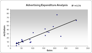
 
The R-squared value is your Coefficient of Determination (COD) that will tell you how strong your data on your two axes. In the example above, the COD value is .74 (or 74%) representing a strong correlation between spending advertising dollars on Tuesdays and increased sales.

Then simply do the same for your Thursday data, and compare the size of the CODs. If you get, for example, a Coefficient of Determination of 74% on Tuesday and 29% on Thursday, it is a strong indication that you should Spend your money on Tuesdays!

Try using the combination of a Scatterplot Chart, Linear Trendline, and a COD, and see how easy it is to do some very worthwhile analysis.

Thursday, March 24, 2016

Whoa, What’s This?

As with so many things in Excel (and much of life…), it is easy to overlook some incredibly useful and convenient resources.  I say, look here Watson, the information is available right on our Status Bar! 

Most of you probably are probably aware of the real-time Status Bar display of common data such as Average, Count, and Sum for any cells you have selected.

However, what you may have overlooked (I know I did for a long time…) is that there an incredible collection of Excel Goodies right at your fingertips!  Simply Right-Click the Status Bar and Presto!  You will see a List of 26 pieces of Information that can be instantly accessed or controlled in this area.
 
For example, you can easily insert or delete the Number Count, Maximum or Minimum, Average, and so forth.  But don’t stop here!  You can also Control such handy goodies as Macro Recording, Zoom, Fixed Decimal, Signatures, and much more!

What makes this all So Cool is that it resides right there at the bottom of your worksheet and it continually available whenever you need it.  Take a look at your Status Bar and see what you might have been missing. Control at your fingertips, just waiting to be of service to you. Give it a try!

Thursday, March 17, 2016

The Curious DATEDIF

The marvelous holiday of St. Patrick’s Day is an excellent time to revisit the Curious function of DATEDIF. For most of us, (Irish or not), Excel handles our typical numeric data in an intuitive manner. Dates, however, can be a bit worrisome at times.

If you have been working with Excel for some time, I am sure you know that the way Excel handles dates can be a bit “Curious” at times. Finding the Difference between two Dates, for instance, is not readily intuitive, so for this day of green, we are going to look at the totally cool DATEDIF function!

Curious Note
One small curiosity about DATEDIF is the fact that it is not a “documented” function in Excel. Not in Excel 2007, 2010, 2013, or 2016. You cannot, for example, go to the Insert Function wizard and find it in any of the lists.

The Syntax of the DATEDIF Function is Entirely Simple:

=DATEDIF(“First Date”, “Second Date”, “Time Interval”)

Where the Time Interval is expressed as follows (Important Note: Unless referring to cell values for the dates, all arguments must be enclosed in Quotation Marks):

d” (Days) = Number of days between the dates
m” (Months) = Complete calendar months between the dates
y” (Years) = Complete calendar years between the dates

An interesting and rather fun way to apply this function is to nest the TODAY() function into it and calculate a Person’s Age. The TODAY() function, of course, returns the Current Date, and when used with DATEDIF, it can produce an Excel calculator that you may find, well, curiously amusing.

=DATEDIF(BirthDate, TODAY(), “y”)

Another interesting way to use DATEDIF and TODAY is to make a dynamic Day Number Calculator. The elapsed number of days in the current year can be determined in a Single Cell with the formula:

=DATEDIF(“1/1/2014”, TODAY(), “d”)

By keeping this little hidden Green Gem in mind, you may find great many ways to use the DATEDIF function in the future. It really is Curious that it isn’t formally documented. Happy St. Patrick’s Day, All!