Thursday, February 25, 2016

Summarizing Your Data

Oftentimes, the simplest solution is the best approach. Let’s say that you have a large Database of Company Clients and the State in which they reside. Since it would likely be interesting to all of the stakeholders in the company to see a Summary of how many Clients you have in Each State, you have decided to use a bit of Excel magic to produce this summation.

If you have read this blog for any length of time, you know that I am a great believer in Named Ranges, so first of all, Name the Range that contains the Clients. This can be done simply by selecting the range, (you can include blank cells not yet filled to allow for future growth), and type the Name of the Range in the Name Box in the upper-left-corner of your worksheet. In this example, we will assume you have named it “State”.

Then you can list the States in the database, and (assuming your first entry is in A2) put in the following formula in the first adjacent cell:


  =Countif(State, A2)

Then it is a simple matter of copying the formula down next to each city and, Presto!, You have your Summary of Clients!

As I like to say, oftentimes the Simple Ways are the Best…

Friday, February 19, 2016

2016 Top Ten Shortcuts

Keyboard Shortcuts are one of my favorite Excel features.  As I have told have told hundreds of Excel students of mine over the years, they can add speed, efficiency, relief from the stress of mouse fatigue. 
 
These shortcuts are very accessible, and you can believe me when I say they will set you apart from the masses of Mediocre Excel Users.

So, in Reverse Order, here is my Current Favorites List (and highly recommended) of Top Ten Excel Keyboard Shortcuts for 2016:
 
10. CTRL+H - Find and Replace (How could you work without it?!)
9.  ALT+F1 - Creates an Instant Chart of the selected data (Super crowd pleaser!)

8.  CTRL+SHIFT+% (Applies the Percentage Format with no decimal places – Cool!)
7.  CTRL+; (Enters the Current Date – I’m a time freak…)
6.  Ctrl + Home (Brings you to the Start of the Worksheet – Oldie, but a Goodie!)
5.  CTRL+9 - Hides the selected rows (Cleans up your worksheet, and it simply Cool!)
4.  SHIFT+TAB - Moves to the Previous Cell (Once you get used to it, you will use it!)
3.  F5 - Brings up the Go TO dialogue box (Navigating to a named range is a snap!)

2.  CTRL+K - Displays the Insert Hyperlink dialog box for new hyperlinks (Helps you mimic websites in your workbooks!)
 
And my Current #1 Favorite Keyboard Shortcut for 2016 is (Drumroll please…):

1.  Shift+F10 – Opens the right-click menu (Incredibly useful when your fingers aren’t on the mouse…)

Give these shortcuts a try sometime.  I am sure that you will be glad you did!

Thursday, February 11, 2016

Add Some Pizazz!

Let’s face it, Excel workbooks and charts can be a bit dull.  That does not have to be the case, however!   Here are 4 Super-Easy Ways to bring some Pizazz (Everybody can use a bit of pizazz now and then…) to your masterworks, and help assure that you get the recognition you deserve. 

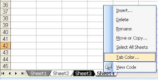
 1. Change the Color of Your Sheet Tabs

Right click on your worksheet and select “Tab color” option to change the worksheet tab color.  If your workbook has quite a few pages, you may even want to devise a color scheme that aids navigation.
 
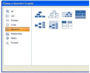
2.  Insert a Quick Organization Chart

Not just for corporate settings, these quick-and-easy charts have several uses. Click on the Insert tab on the toolbar and go to SmartArt and choose the “Hierarchy”group.  Pick the Org Chart that best fits your needs.

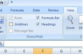
 3.  Hide the Grid Lines on Your Worksheets

One of my favorites.  Do away with clutter by going to the View tab on the toolbar and Deselecting the box next to Gridlines.  Make your worksheets look clean, professional, and easy to read with this simple step.

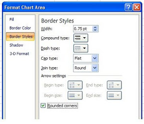
 4.  Add a Rounded Border to Your Charts

This is so simple, you’ll laugh.  Just right-click on your chart, select Format Chart option, and choose “Rounded Borders”.  Purely aesthetics, of course, but a quick way to present your work in a way that is more pleasing to the eye.

The important thing to remember is that any of these techniques can be done in the blink of an eye, so why not take advantage of these simple tools and Add a Little Pizazz!

Thursday, February 4, 2016

Text to Columns Revisited

A couple of years ago, I did a post on the Text to Columns tool in Excel.  Judging by the number of hits it has received, its popularity bears taking another look.

The Text to Columns tool is particularly worth discussing further, as it is highly useful and often overlooked by even longtime Excel users.
 
As any analyst knows very well, data isn’t always presented in the most ideal formats for use in Excel.  Data may come from a variety of robust data storage sources, or even from such unlikely places as Word documents! 
 
Here is an Example of How the Text to Columns Tool Works:

To illustrate, we will use the following string of numbers (intentionally rudimentary…) that you may find in a Word document or any other numerous sources:

14, 22, 36, 35, 64, 34, 28, 94
  1. Select the string, copy it, and paste it into a cell in Excel (in this example, A2 was used)
  2. Select the cell and click on the Text to Columns icon on the DATA ribbon
  3. The Convert Text to Columns Wizard will appear giving you the following two major options:
    • Delimited – Characters such as commas separate each field
    • Fixed width – Fields are aligned in columns with spaces between each field
  4. In our example, we choose Delimited since our numbers are separated by commas
  5. Following the steps in the Text to Columns Wizard gives you the choice to pick your desired format:
    • General
    • Text
    • Date

It’s as Simple as That!  It really is that easy to get your data into Excel in proper alignment and format. Have no doubt about it, Text to Columns is a very worthwhile gadget for any Excel user to have in their tool belt. Give it a Try!

Wednesday, January 27, 2016

Formatting Your Charts

Aesthetics is often scorned by would-be Excel gurus. “The data is all that matters”, they may say. “How it looks doesn’t matter”, they scoff.

Well, they are right to a point, but they are missing the fact that if people find your work easy to understand, professional-looking, and agreeable to look at, they will take it more seriously and give it the attention it deserves. Charts are, after all, one of the most powerful tools in Excel. Chart Visually Convey your data in an easy-to- comprehended (done correctly, of course…) manner. 

Consequently, it is well worth any true guru’s time to assure the charts he or she has created conveys skill and insight. No one has any time to waste on frivolous enhancements, so here is a Quick, 2-Minute Drill to get real Value for your Chart-Improvement Efforts:

1.  Chart Type: Quickly scan the types of charts available and consider which suits your illustration be best (it may be one which your department has never used before).

2.  Gridlines often add Clutter your visual information. If that is the case, then Right-Click and Delete the Gridlines!


3.  Legends
seldom add any additional information to a well-constructed chart. Assure that the chart is communicating well and then Right-click and Delete the Legend - Hasta la Vista, Baby!

4.  Formatting:  Add a little Zing to your charts by Formatting Your Plot Area. Right-Click and choose a Gradient Fill that adds a touch of Finesse while maintaining a professional look.

5.  Rounded Corners can add a bit of class to your chart and set it apart from the mundane. Go to Format Chart Area, select Border Styles, and put a check mark next to Rounded Corners. Totally Cool!

Taking an extra minute or two can Separate Your Work from the commonplace charts that we all see too often. A wee bit of effort can make all the difference!

Thursday, January 21, 2016

A Primer on Prime


Prime Numbers, those curious digits that are divisible only by the number 1 and by themselves.  Mathematicians and other sundry geeks have long been fascinated with these oddities.  Just yesterday, NBC News ran a story that the current largest prime number ever discovered is more than 22,000,000 digits long!  (Ummm, and how many football fields long would that be?...).

In Excel, you can test to see if a number is Prime by creating a Custom Function called ISPRIME (pretty geeky!) with the following VBA code:

Function ISPRIME(num As Long) As Boolean
num_root = Sqr(num) + 1
If num < 2 Then
ISPRIME = False
ElseIf num = 2 Or num = 3 Then
ISPRIME = True
ElseIf num Mod 2 = 0 Or num Mod 3 = 0 Then
ISPRIME = False
Else
For i = 6 To num_root Step 6
If num Mod (i - 1) = 0 Or num Mod (i + 1) = 0 Then
ISPRIME = False
Exit Function
End If
Next
ISPRIME = True
End If
End Function

Taking this a step further, we can explore Mersenne Prime Numbers. A Mersenne number is in the form of Mn=(2^n)-1. Although Excel does not have sufficient power to do this in great depth, it is fun to see what can be done with our favorite spreadsheet software.

With the assumption that you have a
Bit O’ Geek in you, here is what you can do. 

1. Create a simple spreadsheet with a similar format to the following starting in A1:

2. Starting in A3, insert consecutive numbers starting with 2 into Column A.
3. In B3, place the formula, =(2^A3)-1 and copy down with relative references
4. Lastly, use the custom ISPRIME function starting in C3 to determine if the numbers in Column B are prime 

Whether you find this Cool or not will be a factor of your individual Geekiness.  If you are like me (you poor soul…) you may well find this Totally Rad!

Thursday, January 14, 2016

Little Known Tricks…

Some little-known Excel tricks (for keyboard or mouse) are Totally Cool, and if you have never run into the topic of this week’s blog, I am sure you will agree that it is a potential Crowd Pleaser!

Let’s say that you have 14 columns of data for which you want to calculate the Sums. “Piece of Cake”, you say!  Well, you’re right, it won’t take more than a couple of minutes to set up and accomplish.  But what if you want to do it with Style and Panache?  Here is what you do: Simply select the Entire Block of data, and press Alt + = on your keyboard. Ala Kazam! The sums for All of your columns will instantly appear like magic in the row below your data.

Some More Fun
You can do even more Magic by once again selecting the entire range of data and choosing Average, Count, Max, or Min from the AutoSum icon on your toolbar. The calculations will, once again, Instantly Appear for all columns of data!


There are, of course, several different ways of achieving the same results in Excel. The Key is to do it with Speed and Flair! After all, you want to be one of the Cool Kids, right? Give these tricks a try, and listen to everyone go Oooh and Aaaah…