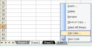
Right
click on your worksheet and select “Tab
color” option to change the worksheet tab color. If your workbook has quite a few pages, you
may even want to devise a color scheme that aids navigation.
2.
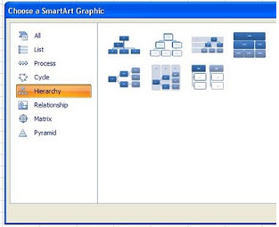
Insert a Quick Organization Chart
Not
just for corporate settings, these quick-and-easy charts have several uses. Click
on the Insert tab on the toolbar and go to SmartArt and choose the “Hierarchy”group. Pick the Org Chart that best fits your
needs.
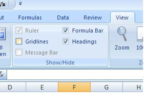
One
of my favorites. Do away with clutter by
going to the View tab
on the toolbar and Deselecting the
box next to Gridlines. Make your worksheets look clean,
professional, and easy to read with this simple step.
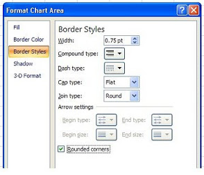
This
is so simple, you’ll laugh. Just
right-click on your chart, select Format Chart option,
and choose “Rounded Borders”.
Purely aesthetics, of course, but a quick way to present your work in a
way that is more pleasing to the eye.
The
important thing to remember is that any of these techniques can be done in the
blink of an eye, so why not take advantage of these simple tools and Add a Little Pizazz!

1 comment:
شات بنات مصر
شات بنت مصر
chat
شات بنات مصر
شات بنات مصر
شات مصرى
شات مصرى
شات مصري
بنات مصر
دردشة
شات بنت
شات
شات
http://www.eg-girls.com/
شات بنت مصر
chat
شات بنات مصر
شات بنات مصر
شات مصرى
شات مصرى
شات مصري
بنات مصر
دردشة مصرى
دردشة مصرية
دردشة مصر
دردشة
بنات مصر
دردشة
شات بنت
شات
شات
شات
شات مصر
شات مصرية
شات 12
شات مصرى
شات بنات مصر
شات مصرى
بنات مصر
دردشة
شات مصرى
شات بنات
شات مصر
شات مصرية
شات مصر
شات مصرية
Post a Comment