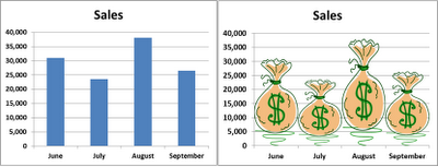
You can easily Add Impact to your charts by doing the following:
1. Copy a Graphic (simple images work the best) to your clipboard
2. Create your Chart using columns or bars
3. Select the Chart Column or Bar Series
4. Go to your Home Tab and Paste the image
5. Bonus: Format the Data Series by going to Series Options and choosing 0% Gap Width
Since I live in southern California, I chose a Surfboard Graphic for my Surfing Days Chart above. To demonstrate the difference this can make, I did a Side-by-Side illustration below. I chose a Bag of Money to replace the Boring column to depict the sales by month.
Picture Charts. Another way to Add Interest and Impact to your Excel worksheets.
Surf’s Up!


No comments:
Post a Comment