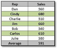
Good communication is the life blood and Bane of business. This fact could not be truer than in reports and presentations that involve numbers (Financial and Performance reports are notorious examples). Nothing causes the glazing of eyes like a large table of numbers with row after row of monotonous monotone data.
So how do we get our numerical information across to our stakeholders in an efficient and engaging manner? Well, although Charts are obviously very effective, they are not the only method. Conditional Formatting is a very powerful technique that should not be overlooked.
Taking a simple table of sales data as an example, let’s say that you would like to have your audience be able to easily identify those reps with sales greater than the average. First, create a simple formula in the last row that calculates the average of all sales, (e.g. “=Average(B2:8)”). Then set your Conditional Formatting for the first row to highlight (I like to choose my own formatting set to give it a bit of a custom look) if the value in the numerical column is greater than the cell displaying the average (=B2>$B$9).
Then it is a simple matter of selecting the cells with conditional formatting, clicking the Format Painter, and “painting” the rest of your table. Bamm! Instant impact and improved communication! This is Easy (and “Easy” is Good). Give it a try and brace yourself for Accolades…

No comments:
Post a Comment