
Funnel Charts,
(Not to be confused with Funnel Cakes,
which are something completely different…), are one of the newer features
in Excel that deserve a closer look. This new chart that appeared
in Excel for the first time last year, is excellent for illustrating processes
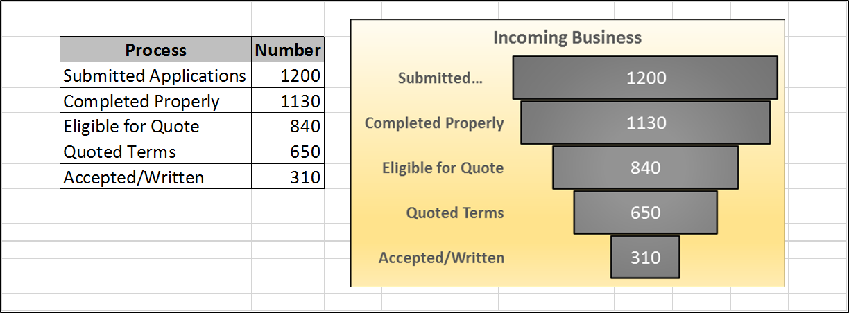
that incrementally become more focused as each stage is completed. Since I have
extensive experience in the insurance industry, I am showing how business “Funnels”
into an insurance company.
You will have to have the latest version of Excel, of course, but
it is a good idea to frequently update anyway…
With reference to the Funnel Chart above, here are the Simple
Steps:
1. As
in the illustration (which you may have to enlarge for best viewing), use one
column for the Process steps and the other for
the Amounts
2. Select
the Data in the simple table you have created
3. Click Insert > Recommended
Charts > Funnel
4. Format
according to your tastes and/or your
audience
The result is a remarkably easy-to-understand (which should be
a major goal of Any chart…) illustration of how your processes interrelate. This
new chart will be, I am quite sure, very useful for many of us in the
future. Funnel Charts – Another way to picture
your data and enhance your business communication!
ReplyDeleteYour blog is so nice, and the article is very good it helps to so many people.
Oracle ADF Training in Hyderabad
Good Job, This article is really helpful. Thanks for sharing with us
ReplyDeleteExcel Search and Replace Batch.
Thanks dear for sharing this great information.
ReplyDelete9th Class Math
Nice article, so useful article for us.
ReplyDeleteExcel Search and Replace Batch
Good job, the Article looks great.
ReplyDeleteExcel Find and Replace
Nice article and your blog, Thanks for sharing with us.
ReplyDeleteExcel-utilities