Wednesday, February 25, 2015

Printing Worksheets


Have you ever Printed one of your worksheets that you wanted to bring to a meeting, and discovered that it printed on Several Pages of paper, rather than on One (which was wanted you wanted to bring to the meeting…)?

Sure you have; we all have had this happen to us at one time or another (let’s face it, we are not as yet in a totally Paperless work environment…).

A typical example is that some of your data on the right side of your worksheet (perhaps just a column or two) prints on its own page.  This obviously doesn’t make a very appealing handout for your meeting.  Bummer!  So, what do you do?

I’ll bet some of you have tried resizing your fonts or your column/row widths, and hoped for the best when you reprinted your handout.  Whereas that may work, there is a handy tool in Excel that makes it so much easier.

All you have to do is go to View / Workbook Views / Page Break Preview. In this mode, you can easily Control how your worksheet prints with a minimum of effort!

In Page Break Preview you get a look at your worksheet with page breaks shown as Dashed Blue Lines. The dashed lines show the Automatic page breaks which Excel has chosen by default. By hovering you mouse pointer over one of the lines, you can left-click/hold and move it wherever you wish. The lines will then become Solid Blue, indicating the Manual Page Breaks that you have chosen (Cool!).

A Small Word of Caution
This technique is highly useful when you have just a Very Few columns or rows that do not initially print on the single page you wish to distribute.  What happens when there are Many columns or rows that you wish to add to your printed sheet, however?  It may be tempting to manually slide your Page Breaks to include a significant volume of columns or rows, so that you can have an Elegant One-Page Handout for your meeting.  Guess what?  It works!  You will, indeed, get all of your data printed on One Page!  You may, however, need to invest in some Magnifying Glasses so your audience can read it!

Page Break Control; Another Excellent Excel Tool that puts you in Control and saves you time!  (Good Stuff…).

Wednesday, February 18, 2015

Excel Detective Work

Doing a bit of Detective Work is sometimes necessary in Excel.  For instance, you may have inherited an Excel workbook from a former coworker, wish to investigate the techniques used by a current colleague, or merely refresh your memory on how you created a workbook in the now fuzzy past.

Whereas there are specialized commercial tools for doing hardcore fraud auditing on Excel worksheets, most of us simply need a Couple of Techniques that will provide a glimpse into what is going on in the background of our spreadsheets:

1)  Are there Formulas Employed in My Workbook?

Rather than manually checking each cell or range to reveal the formula in the Formula Bar, (as used to be the case in some of the older versions of Excel), you can reveal all of this information in your entire worksheet with the Keyboard Shortcut:


Ctrl + ~

By selecting any cell within your worksheet and then using this simple keyboard combination, All of the formulas in All of your cells will be revealed.  You can then proceed to investigate further to see if there are any flaws in their construction.

2)  In-Depth Review of Precedents and Dependents

If you need an Omnipotent View of what your data is doing, where it is going, and where it is coming from, try using the tools in the Formula Auditing group on the Formulas tab. The tools include Trace Precedents, Trace Dependents, Show Formulas, Error Checking and more.

One of the great advantages of using the Formula Auditing tools is the fact that the information is returned in Easily-Understood Graphics that help you make Quick Sense of what is going on in your workbook.  Once armed with this information, you can proceed to work the magic that has earned you the Office Excel Guru alias.

Some simply applied tools to help you do your Sherlock Holmes work in Excel.  And it’s all quite Elementary, my dear Watson

Wednesday, February 11, 2015

Negative Space and CF

Making your data Come Alive in Excel is much more than mere esthetics.  Indeed, it is all about better communication and the dissemination of information.

We are all familiar with Conditional Formatting, and probably most of us have used it to highlight important information in our workbooks.  A unique method of doing this takes a Reverse (or Negative) approach to this however.  Let’s explore this cool way to use Conditional Formatting:

For instance, let’s say you have a worksheet in which you are entering data (it may be numbers, text, or mixed) in a field, and you want it to be Very Apparent if a cell within that column is Blank (this is a recommended practice for good database maintenance). Here is a truly different way to do this:

For sake of example, let’s say you are going to be putting data in the short range of A1:A16.

1. Your first step is to apply a Fill Color to your range (A dark gray is a good choice.)

2. Then select your range and go to Conditional Formatting / New Formatting Rule

3. Choose Use a formula to determine which cells to format and put the following:


4. =IF(NOT(A1=""), TRUE, FALSE)

5. Finally, for your Format, use Fill / No Color

Now whenever you place data (numbers, text, or mixed) in one of your cells in the range, the dark gray Fill Color is Cleared! Bamm, it’s gone!

The cells that do NOT have data entered into them will retain the Original Fill Color.  Try this out and see if this does not make your worksheet Come Alive!

Wednesday, February 4, 2015

Combo Charts Revisited

In my current class of Excel Gurus, I once again reiterated one my favorite maxims, “If you have to think about what the chart is trying to say, it’s a Bad chart”.  So how do we communicate better with our charts?  Enter Combo Charts, which are a one of the mainstays when improving your message in your Excel Charts.

Let’s say you want to compare the number of your Customers for two years, and you want to be able to instantly see which months were the big hitters and which were the duds.  This is easily done, and can be enhanced using Combo Charts and the addition of a bit of attentive formatting.

Let’s Look at an Example:


1. Create a standard Column Chart using the table below:

 2. This will produce the totally ugly and Difficult-to-Decipher Standard Column Chart as illustrated below (you really do not want to use this style and format…):


3. Right-click once on any single column for the year 2013. This will select all of the columns for that year.
4. You can then select Change Series Chart Type and choose an Area Chart
5. Double-click on your chart, and bring up the Design Tab Tools.
6. Then take a couple of minutes to add some visual appeal by formatting your chart to create an easy-on-the-eyes chart similar to the one below:


And there it is! You have created a Combo Chart that Communicates Effortlessly with your spreadsheet viewers. Totally Cool!


Wednesday, January 28, 2015

INDEX/MATCH vs. VLOOKUP

I have a group called Excel Enthusiasts (catchy title, eh?) on LinkedIn that I started several years ago.  It currently has over 16,000 members from over 60 countries.  Recently, one of the leading discussions has been on which is better, VLOOKUP or INDEX/MATCH. 

Clearly, VLOOKUP is by far the most frequently used function in this instance, primarily because it is the more unassuming formula, but also because most Excel users simply don’t understand how to use the INDEX/MATCH combination.

The major drawback of VLOOKUP is it requires a static reference in the form of the first column.  Not very cool.  INDEX/MATCH on the other hand, is much more flexible, allowing you use whichever column you choose for your reference.  Much cooler.

Let’s take a look at a simple example using the Illustration below:

Let’s say you wish to create a Code Retriever.  MATCH returns the Row Number of the location in an array of value you specify. Using the example above, the number “4” is returned by the formula:

=MATCH("Tampa", $A$2:$A$8,0)

INDEX, on the other hand, returns the Value that you identify by row number in an array. Using the example above, “Tampa” is retuned by the formula:

=INDEX($A$2:$A$6,4)

Combining the INDEX and MATCH functions is where the Real Power comes in. Let’s say we want the Code for San Diego. We can set up a Code Retriever as shown in cells E1:F2, by inserting the following formula in cell F2 (This will return "141"):

=INDEX($C$2:$C$8, MATCH(E2, $A$2:$A$8, 0))

Using the MATCH and INDEX functions together is truly a Powerful way of extracting data when you need it. Once you try it, you may never go back to VLOOKUP again!

Wednesday, January 21, 2015

Validation is Good Stuff...

I am currently teaching an Excel class to a fine group of intermediate-advanced users.  One of the topics we are reviewing is the many uses of Validation. 

Validation can be useful in many arenas, including the maintenance of Integrity of your data, (we’ve all heard of GIGOGarbage In Garbage Out), convenient Drop Down Boxes, informative Popup Alerts, and much more.

Maintaining Integrity
If you know that only certain data should be entered in a range, you can easily control this by using one of the many controls in the Allow dialogue drop down.  You can control size or range of numbers, text considerations or, as in the example below, which words can be entered (in this case, True or False…).


Drop Down Boxes
Drop down boxes can add interactivity and professionalism to your worksheets.  By choosing List in the Allow box, you can select a range of cities, employees, customers, companies, whatever you find useful.  In the example below, as list of sales representatives was selected.


Popup Alerts
By using boxes included on the Input Message tab, you can create a Popup Message whenever a user clicks on a cell within the range this Validation is used.  This can be further useful in assuring that the proper information is being put into your database, and it helps jog the memory of the user entering the data.

Validation.  Many uses, many benefits.  Really Good Stuff!

Friday, January 16, 2015

Frequency Functions and Tables

Array Functions are one of those categories of Excel tools that most Excel users have never heard of, and mystifies most of those who have.

These mysterious functions can be quite useful, however, and when you learn how they are activated, you will laugh at how easy (albeit unusual) they are to use.

If you want to do some analysis on how frequently values within particular ranges occur (rather than looking at each individual occurrence), for instance, an excellent solution in Excel is the Frequency Function.  This valuable tool works as an Array Function that counts the number of values that occur in each specified interval (or “Bins”, as they are typically called).

The FREQUENCY Function syntax is as follows:
        FREQUENCY(DataArray, BinsArray)

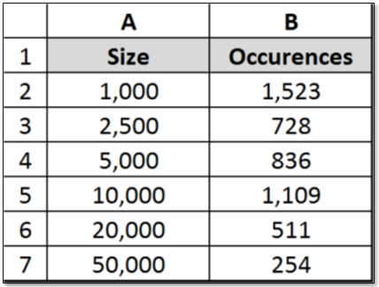
The function utilizes a database for a source, and is entered as an Array formula after you select a range of adjacent cells (B2:B7 in our example) into which you want the distribution to appear. After you select the data and bins arrays, press CONTROL+SHIFT+ENTER (this is what mystifies many users…).

The following example shows the “Bins” under the heading Size and the Frequency of claims within each range under Occurrences:


Special Note: The number of elements in the returned array is one more than the number of elements in bins array. The extra element in the returned array returns the count of any values above the highest interval.

Illustrations of key applications of the Frequency Function will be explored in future blogs that will be published soon.  In the meantime, take a 5-minute look at this vital tool.  You may find that it is not all at mysterious